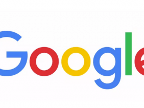
Google who is undergoing restructuring at the moment has done it again, and this time, it is the logo that was retouched. The new Google logo was unveiled today with a Sans-serif font type, giving it a real feel modern look.

According to Google blog post;
Today we’re introducing a new logo and identity family that reflects this reality and shows you when the Google magic is working for you, even on the tiniest screens. As you’ll see, we’ve taken the Google logo and branding, which were originally built for a single desktop browser page, and updated them for a world of seamless computing across an endless number of devices and different kinds of inputs (such as tap, type and talk).
On the new Google homepage, an animation plays that wipes away the old design off the screen and writes the new one.
This is not the first time we are changing our look, and definitely not the last. The post said.
Watch Google evolution video here:

